We think you are located in United States. Is this correct?
We use this information to present the correct curriculum and to personalise content to better meet the needs of our users.
Open Textbooks
Download our open textbooks in different formats to use them in the way that suits you. Click on each book cover to see the available files to download, in English and Afrikaans. Better than just free, these books are also openly-licensed! Refer to the different open licences for each download and the explanations of the licenses at the bottom of the page.
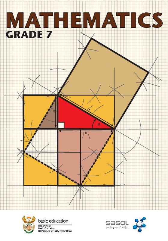
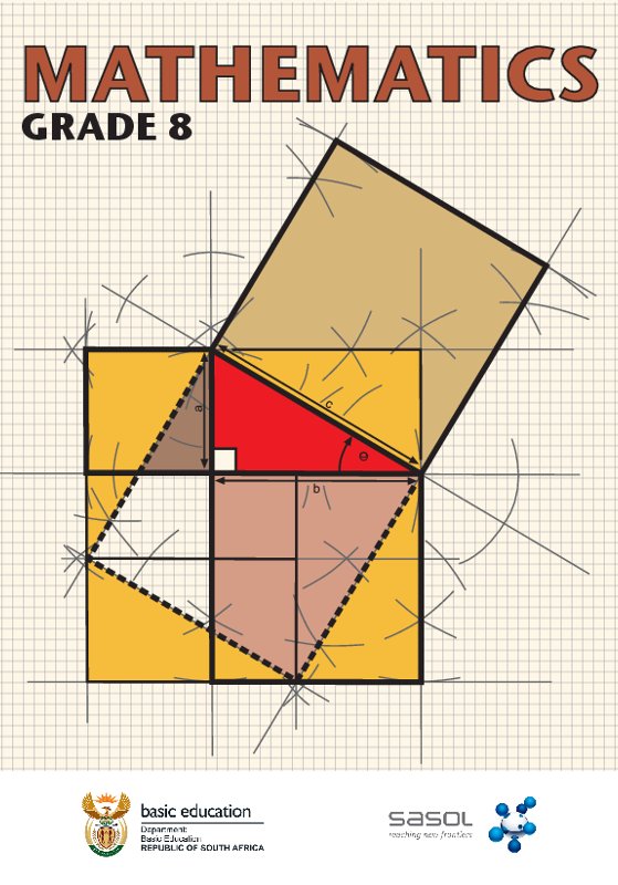
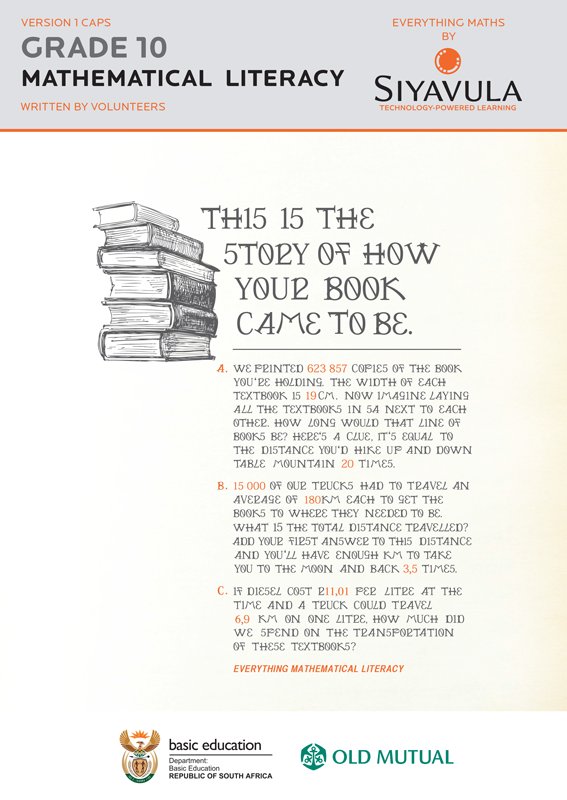
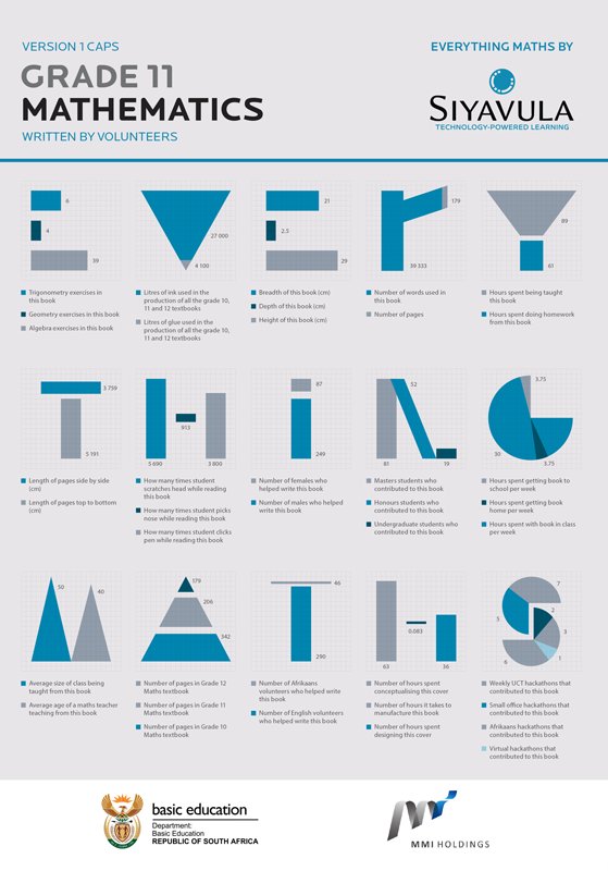
Maths
-
- Read online
-
Textbooks
-
English
-
Afrikaans
-
-
- Read online
-
Textbooks
-
English
-
Afrikaans
-
-

- Read online
-
Textbooks
-
English
-
Afrikaans
-
-
- Read online
-
Textbooks
-
English
-
Afrikaans
-
-
Teacher's guides
-
English
-
Afrikaans
-
-

- Read online
-
Textbooks
-
English
-
Afrikaans
-
-
Teacher's guides
-
English
-
Afrikaans
-
-
- Read online
-
Textbooks
-
English
-
Afrikaans
-
-
Teacher's guides
-
English
-
Afrikaans
-
-

- Read online
-
Textbooks
-
English
-
Afrikaans
-
-
Teacher's guides
-
English
-
Afrikaans
-
Science
-

- Read online
-
Textbooks
-
English
-
Afrikaans
-
-
Teacher's guides
-
English
-
Afrikaans
-
-

- Read online
-
Textbooks
-
English
-
Afrikaans
-
-
Teacher's guides
-
English
-
Afrikaans
-
-
- Read online
-
Textbooks
-
English
-
Afrikaans
-
-
Teacher's guides
-
English
-
Afrikaans
-
-
- Read online
-
Textbooks
-
English
-
Afrikaans
-
-
Teacher's guides
-
English
-
Afrikaans
-
-
- Read online
-
Textbooks
-
English
-
Grade 7A
-
Grade 7B
-
Grade 7 (A and B combined)
-
-
Afrikaans
-
Graad 7A
-
Graad 7B
-
Graad 7 (A en B saam)
-
-
-
Teacher's guides
-
English
-
Grade 7A
-
Grade 7B
-
-
Afrikaans
-
Graad 7A
-
Graad 7B
-
-
-
- Read online
-
Textbooks
-
English
-
Grade 8A
-
Grade 8B
-
Grade 8 (A and B combined)
-
-
Afrikaans
-
Graad 8A
-
Graad 8B
-
Graad 8 (A en B saam)
-
-
-
Teacher's guides
-
English
-
Grade 8A
-
Grade 8B
-
-
Afrikaans
-
Graad 8A
-
Graad 8B
-
-
-
- Read online
-
Textbooks
-
English
-
Grade 9A
-
Grade 9B
-
Grade 9 (A and B combined)
-
-
Afrikaans
-
Graad 9A
-
Graad 9B
-
Graad 9 (A en B saam)
-
-
-
Teacher's guides
-
English
-
Grade 9A
-
Grade 9B
-
-
Afrikaans
-
Graad 9A
-
Graad 9B
-
-
-
- Read online
-
Textbooks
-
English
-
Grade 4A
-
Grade 4B
-
Grade 4 (A and B combined)
-
-
Afrikaans
-
Graad 4A
-
Graad 4B
-
Graad 4 (A en B saam)
-
-
-
Teacher's guides
-
English
-
Grade 4A
-
Grade 4B
-
-
Afrikaans
-
Graad 4A
-
Graad 4B
-
-
-

- Read online
-
Textbooks
-
English
-
Grade 5A
-
Grade 5B
-
Grade 5 (A and B combined)
-
-
Afrikaans
-
Graad 5A
-
Graad 5B
-
Graad 5 (A en B saam)
-
-
-
Teacher's guides
-
English
-
Grade 5A
-
Grade 5B
-
-
Afrikaans
-
Graad 5A
-
Graad 5B
-
-
-
- Read online
-
Textbooks
-
English
-
Grade 6A
-
Grade 6B
-
Grade 6 (A and B combined)
-
-
Afrikaans
-
Graad 6A
-
Graad 6B
-
Graad 6 (A en B saam)
-
-
-
Teacher's guides
-
English
-
Grade 6A
-
Grade 6B
-
-
Afrikaans
-
Graad 6A
-
Graad 6B
-
-
Our book licensing
Better than just free, these books are also openly-licensed! The same content, but different versions (branded or not) have different licenses, as explained:
CC-BY-ND (branded versions)
You are allowed and encouraged to freely copy these versions. You can photocopy, print and distribute them as often as you like. You can download them onto your mobile phone, iPad, PC or flash drive. You can burn them to CD, email them around or upload them to your website. The only restriction is that you cannot adapt or change these versions of the textbooks, their content or covers in any way as they contain the relevant Siyavula brands, the sponsorship logos and are endorsed by the Department of Basic Education. For more information, visit Creative Commons Attribution-NoDerivs 3.0 Unported.
Find out more here about the sponsorships and partnerships with others that made the production of each of the open textbooks possible.
CC-BY (unbranded versions)
These unbranded versions of the same content are available for you to share, adapt, transform, modify or build upon in any way, with the only requirement being to give appropriate credit to Siyavula. For more information, visit Creative Commons Attribution 3.0 Unported.