19.4 Histograms
We’ve explored ways of representing discrete data. Now we will deal with continuous data. We use continuous data when we measure things. It can have any value and can be represented by real numbers, so fractions may be included.
A common way of handling continuous data is to subdivide the full range of values into a few smaller ranges called intervals. Intervals group similar data together, and we count that interval as one category of data.
Histograms are one way of representing continuous data. A histogram makes it easy to see in which interval most of the values in the data set are located, and provides an overview of the distribution of the values in the data set.
There are no gaps between the bars of a histogram. The count of the values within each interval determines the height of the bars.
Worked Example 19.5: Drawing a histogram from a table of values
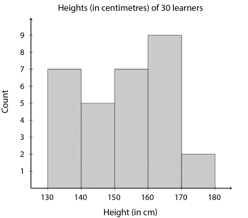
The table below shows the heights (in centimetres) of \(30\) learners.
| \(\text{142,8}\) | \(\text{163}\) | \(\text{169}\) | \(\text{132,5}\) | \(\text{139}\) | \(\text{140,7}\) | \(\text{152,3}\) | \(\text{168,5}\) | \(\text{139}\) | \(\text{150,3}\) |
| \(\text{161,7}\) | \(\text{132,6}\) | \(\text{162}\) | \(\text{172}\) | \(\text{146,5}\) | \(\text{152}\) | \(\text{150,8}\) | \(\text{132}\) | \(\text{157,4}\) | \(\text{133,6}\) |
| \(\text{141}\) | \(\text{170}\) | \(\text{156}\) | \(\text{155,4}\) | \(\text{169}\) | \(\text{138,2}\) | \(\text{142,5}\) | \(\text{160,7}\) | \(\text{164,5}\) | \(\text{168,3}\) |
Group the data into the following intervals and draw a histogram of the grouped data.
Interval \(1\): \(130 ≤ h <140\)
Interval \(2\): \(140 ≤ h <150\)
Interval \(3\): \(150 ≤ h <160\)
Interval \(4\): \(160 ≤ h <170\)
Interval \(5\): \(170 ≤ h <180\)
Count the number of data values that fall inside in each interval.
| Intervals | Count |
|---|---|
| \(130 ≤ h <140\) | \(7\) |
| \(140 ≤ h <150\) | \(5\) |
| \(150 ≤ h <160\) | \(7\) |
| \(160 ≤ h <170\) | \(9\) |
| \(170 ≤ h <180\) | \(2\) |
Draw the histogram.
- Label the horizontal axis using the intervals.
- Label the vertical axis using the count of data values. The table shows that the highest count for an interval is \(9\), so you could label the vertical axis from \(0\) to \(9\).
- Remember to write a suitable title for the histogram.
In the example above, the data has been grouped into five intervals, and each interval includes all the measurements that fall within one \(10 \text{ cm}\) range.
- Grouping is done by defining a set of intervals that suits the data, and then counting how many of the data values fall inside each interval, as shown in the table above.
- The intervals must not overlap, so the intervals cannot be \(130 ≤ h ≤140\) and \(140 ≤ h ≤150\), for example, because \(140 \text{ cm}\) is then repeated.
The intervals must cover the entire range of the data set. In this data set, the smallest height is \(132 \text{ cm}\), and the greatest height is \(172 \text{ cm}\), so the entire range of heights is covered.