How many people were born between the beginning of \(\text{1 994}\) and the beginning of \(\text{1 996}\)?
\(86 + 84 = 170\) million
|
Previous
11.1 Revision
|
Next
11.3 Ogives
|
A histogram is a graphical representation of how many times different, mutually exclusive events are observed in an experiment. To interpret a histogram, we find the events on the \(x\)-axis and the counts on the \(y\)-axis. Each event has a rectangle that shows what its count (or frequency) is.
Use the following histogram to determine the events that were recorded and the relative frequency of each event. Summarise your answer in a table.
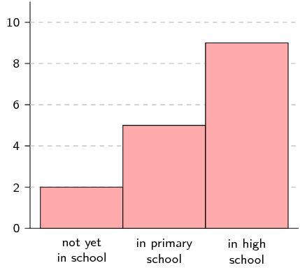
The events are shown on the \(x\)-axis. In this example we have “not yet in school”, “in primary school” and “in high school”.
The counts are shown on the \(y\)-axis and the height of each rectangle shows the frequency for each event.
The relative frequency of an event in an experiment is the number of times that the event occurred divided by the total number of times that the experiment was completed. In this example we add up the frequencies for all the events to get a total frequency of \(\text{16}\). Therefore the relative frequencies are:
| Event | Count | Relative frequency |
| not yet in school | \(\text{2}\) | \(\frac{1}{8}\) |
| in primary school | \(\text{5}\) | \(\frac{5}{16}\) |
| in high school | \(\text{9}\) | \(\frac{9}{16}\) |
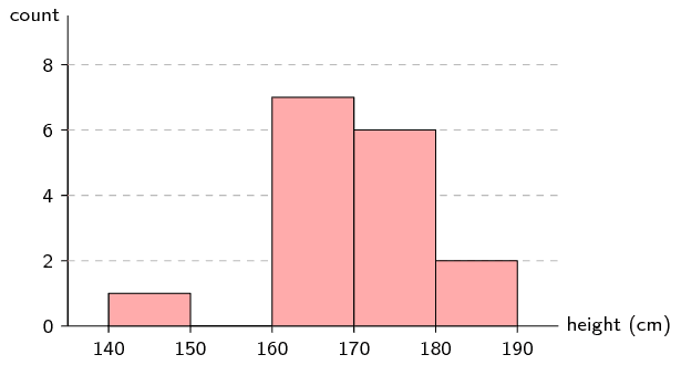
To draw a histogram of a data set containing numbers, the numbers first have to be grouped. Each group is defined by an interval. We then count how many times numbers from each group appear in the data set and draw a histogram using the counts.
The following data represent the heights of \(\text{16}\) adults in centimetres.
\[\begin{array}{l} \text{162}\ ;\ \text{168}\ ;\ \text{177}\ ;\ \text{147}\ ;\ \text{189}\ ;\ \text{171}\ ;\ \text{173}\ ;\ \text{168} \\ \text{178}\ ;\ \text{184}\ ;\ \text{165}\ ;\ \text{173}\ ;\ \text{179}\ ;\ \text{166}\ ;\ \text{168}\ ;\ \text{165} \end{array}\]Divide the data into \(\text{5}\) equal length intervals between \(\text{140}\) \(\text{cm}\) and \(\text{190}\) \(\text{cm}\) and draw a histogram.
To have \(\text{5}\) intervals of the same length between \(\text{140}\) and \(\text{190}\), we need and interval length of \(\text{10}\). Therefore the intervals are \((\text{140};\text{150}]\); \((\text{150};\text{160}]\); \((\text{160};\text{170}]\); \((\text{170};\text{180}]\); and \((\text{180};\text{190}]\).
The following table summarises the number of data values in each of the intervals.
| Interval | \((\text{140};\text{150}]\) | \((\text{150};\text{160}]\) | \((\text{160};\text{170}]\) | \((\text{170};\text{180}]\) | \((\text{180};\text{190}]\) |
| Count | \(\text{1}\) | \(\text{0}\) | \(\text{7}\) | \(\text{6}\) | \(\text{2}\) |
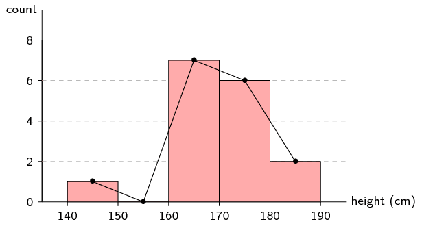
A frequency polygon is sometimes used to represent the same information as in a histogram. A frequency polygon is drawn by using line segments to connect the middle of the top of each bar in the histogram. This means that the frequency polygon connects the coordinates at the centre of each interval and the count in each interval.
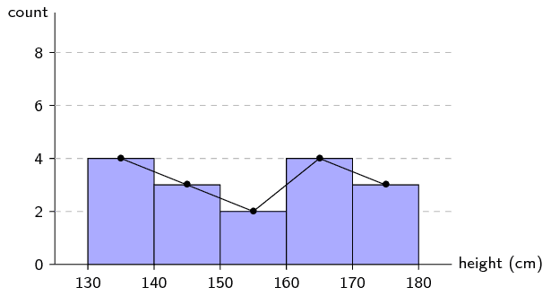
Use the histogram from the previous example to draw a frequency polygon of the same data.
We already know that the histogram looks like this:
When we draw line segments between the tops of the rectangles in the histogram, we get the following picture:
Finally, we remove the histogram to show only the frequency polygon.
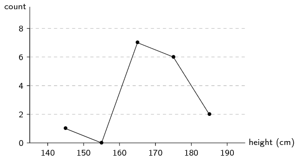
Frequency polygons are particularly useful for comparing two data sets. Comparing two histograms would be more difficult since we would have to draw the rectangles of the two data sets on top of each other. Because frequency polygons are just lines, they do not pose the same problem.
Here is another data set of heights, this time of Grade \(\text{11}\) learners.
\[\begin{array}{l} \text{132}\ ;\ \text{132}\ ;\ \text{156}\ ;\ \text{147}\ ;\ \text{162}\ ;\ \text{168}\ ;\ \text{152}\ ;\ \text{174} \\ \text{141}\ ;\ \text{136}\ ;\ \text{161}\ ;\ \text{148}\ ;\ \text{140}\ ;\ \text{174}\ ;\ \text{174}\ ;\ \text{162} \end{array}\]Draw the frequency polygon for this data set using the same interval length as in the previous example. Then compare the two frequency polygons on one graph to see the differences between the distributions.
We first create the table of counts for the new data set.
| Interval | \((\text{130};\text{140}]\) | \((\text{140};\text{150}]\) | \((\text{150};\text{160}]\) | \((\text{160};\text{170}]\) | \((\text{170};\text{180}]\) |
| Count | \(\text{4}\) | \(\text{3}\) | \(\text{2}\) | \(\text{4}\) | \(\text{3}\) |
We draw the two frequency polygons on the same axes. The red line indicates the distribution over heights for adults and the blue line, for Grade \(\text{11}\) learners.
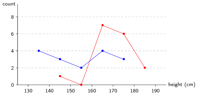
From this plot we can easily see that the heights for Grade \(\text{11}\) learners are distributed more towards the left (shorter) than adults. The learner heights also seem to be more evenly distributed between \(\text{130}\) and \(\text{180}\) \(\text{cm}\), whereas the adult heights are mostly between \(\text{160}\) and \(\text{180}\) \(\text{cm}\).
Use the histogram below to answer the following questions. The histogram shows the number of people born around the world each year. The ticks on the \(x\)-axis are located at the start of each year.
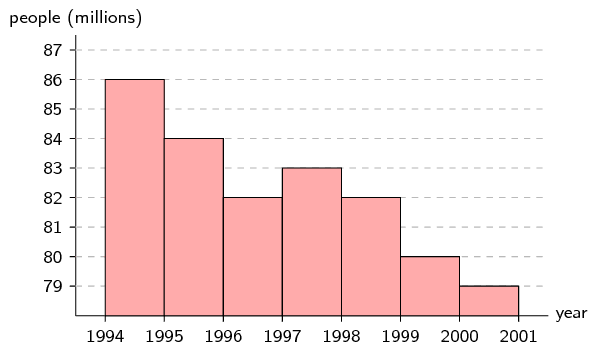
How many people were born between the beginning of \(\text{1 994}\) and the beginning of \(\text{1 996}\)?
Even though the rate at which people are born seems to be decreasing, there are still new people born every year and so the world population is increasing.
How many more people were born in \(\text{1 994}\) than in \(\text{1 997}\)?
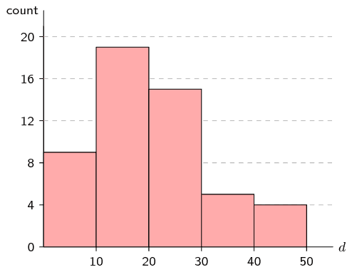
In a traffic survey, a random sample of \(\text{50}\) motorists were asked the distance they drove to work daily. The results of the survey are shown in the table below. Draw a histogram to represent the data.
| distance (\(\text{km}\)) | \(\text{0} < d \le \text{10}\) | \(\text{10} < d \le \text{20}\) | \(\text{20} < d \le \text{30}\) | \(\text{30} < d \le \text{40}\) | \(\text{40} < d \le \text{50}\) |
| count | \(\text{9}\) | \(\text{19}\) | \(\text{15}\) | \(\text{5}\) | \(\text{4}\) |
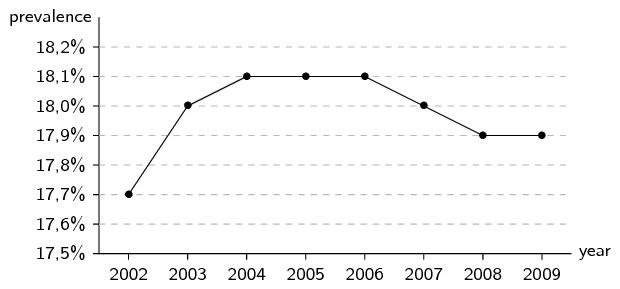
Below is data for the prevalence of HIV in South Africa. HIV prevalence refers to the percentage of people between the ages of \(\text{15}\) and \(\text{49}\) who are infected with HIV.
| year | \(\text{2 002}\) | \(\text{2 003}\) | \(\text{2 004}\) | \(\text{2 005}\) | \(\text{2 006}\) | \(\text{2 007}\) | \(\text{2 008}\) | \(\text{2 009}\) |
| prevalence | \(\text{17,7}\%\) | \(\text{18,0}\%\) | \(\text{18,1}\%\) | \(\text{18,1}\%\) | \(\text{18,1}\%\) | \(\text{18,0}\%\) | \(\text{17,9}\%\) | \(\text{17,9}\%\) |
Draw a frequency polygon of this data set.
|
Previous
11.1 Revision
|
Table of Contents |
Next
11.3 Ogives
|